Does someone think LaTeX is cool only due to its aristocratic-looking font? Decided to fool someone by just installing Computer Modern Unicode (to be obtained here) font and making up a dummy in Photoshop, or worse, MS Word? Ahem, I haven’t had new scalps for ages; it’s time to renew my collection. Mark my words, using CMU font does not provide typesetting quality achieved by TeX system.
Typing a text with Computer Modern in Photoshop yields different kerning spaces and accent angles. Can you tell an artificial image from native LaTeX output? Two examples:
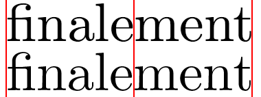
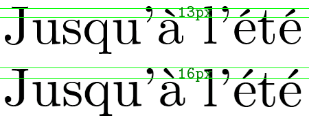
Correct answers: LaTeX, Photoshop, Photoshop, LaTeX. Did you notice that the angle between the artifical-letter accent and horizontal line is too acute?
Finally, some grand comparison via superimposition. Original LaTeX output is blue, Photoshop result is pink, correct juxtaposition is green.
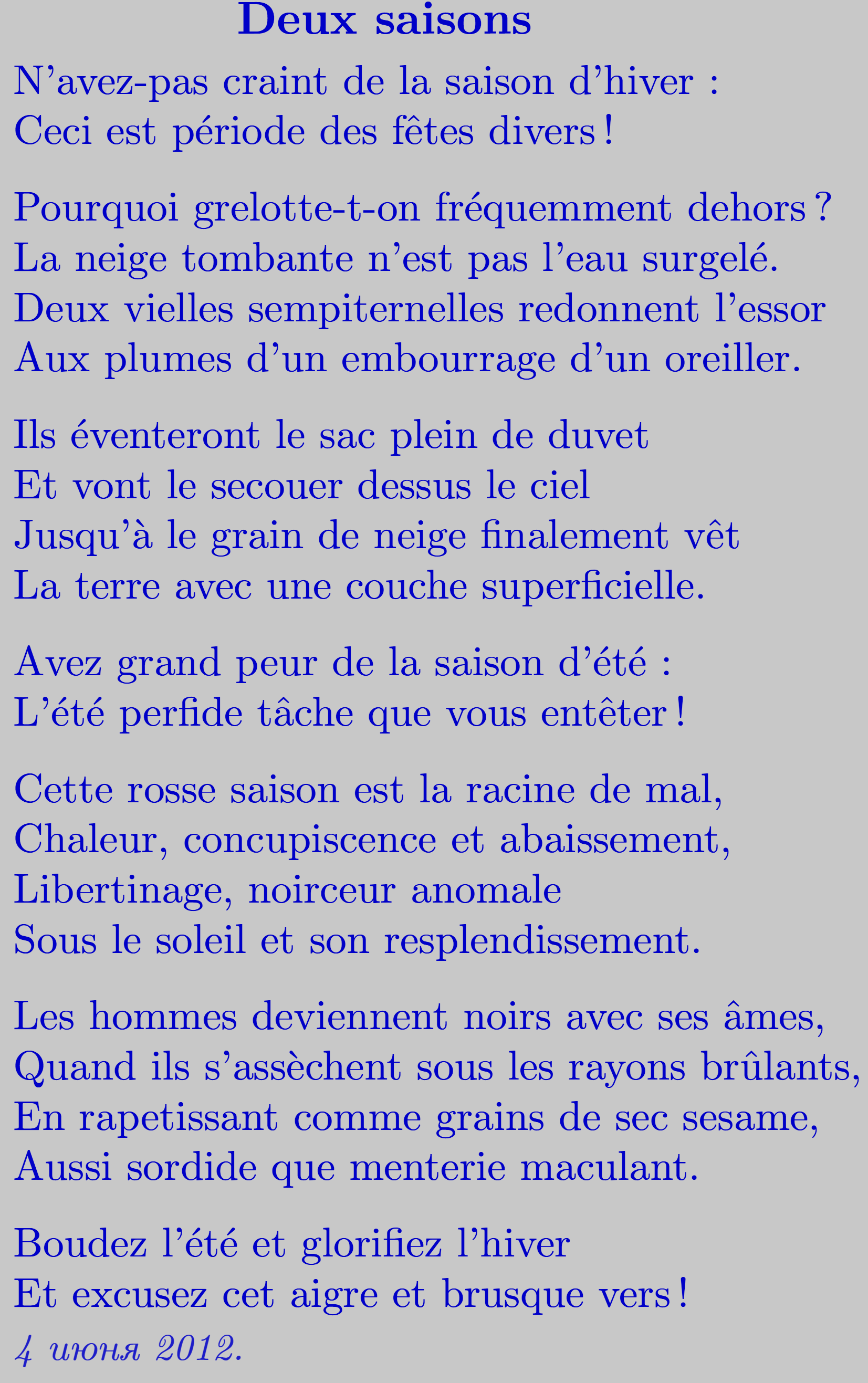
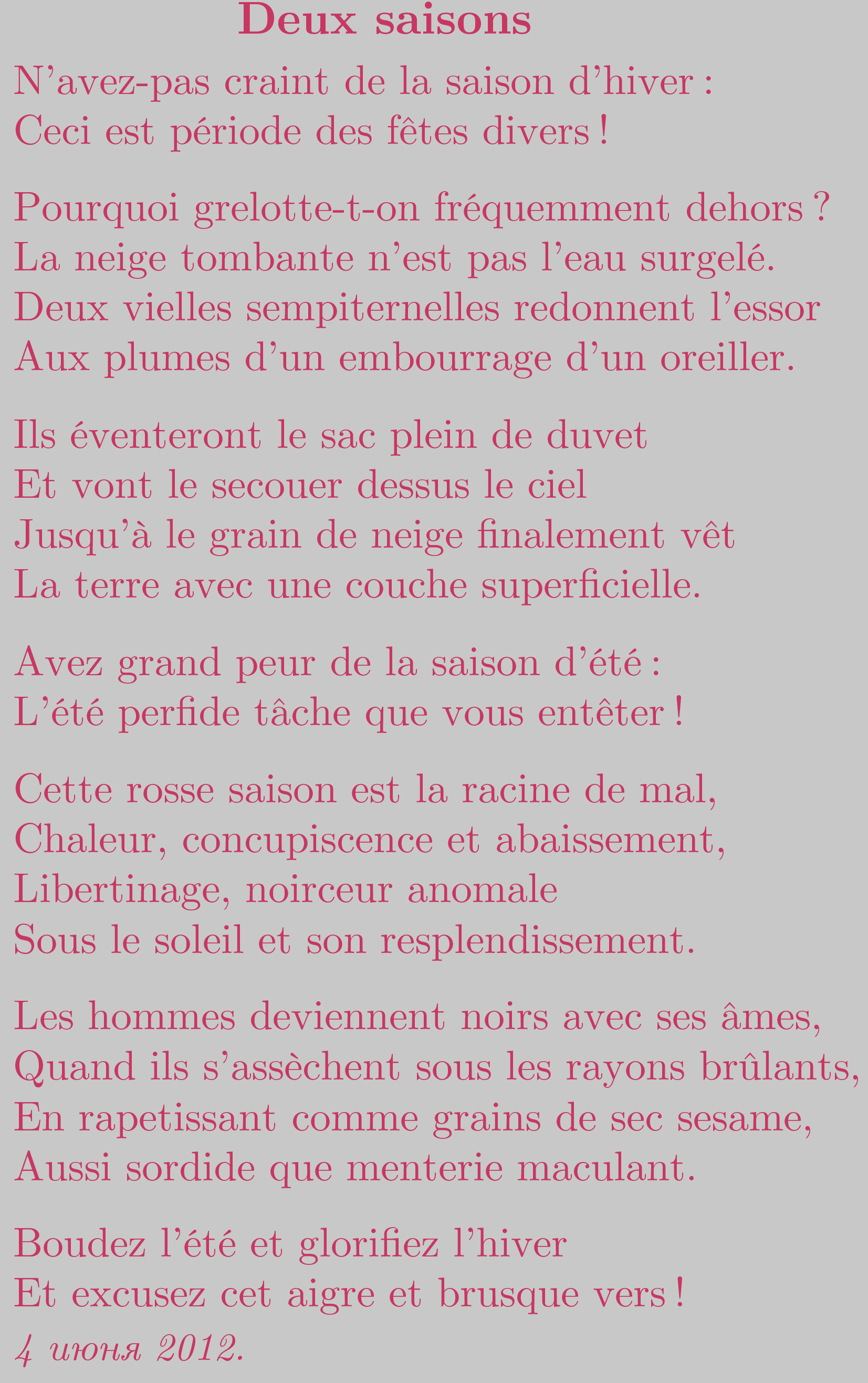
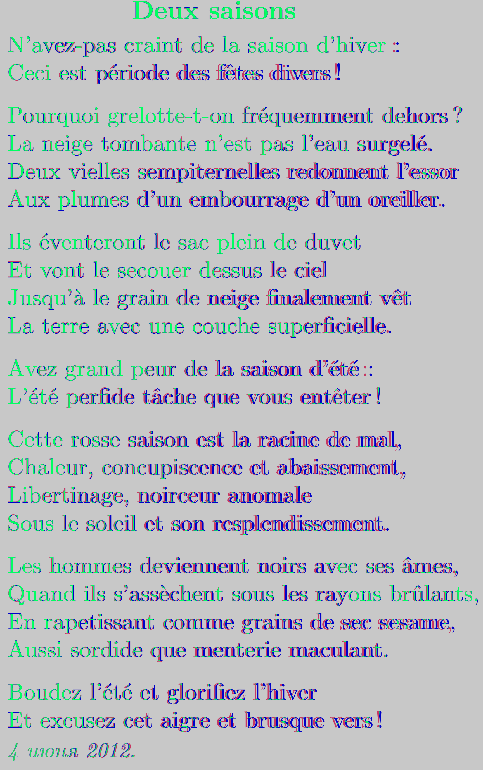
Use no artificial substitutes for this wonderful typesetting engine.